The three candidate cities that are selected to host Summer Olympic 2020; Istanbul, Madrid, and Tokyo are proposing their logos. Even though all seem flowery the are absolutely stunning, what do you think?
Here are the looks at each logo:
Madrid
Original design
Final design
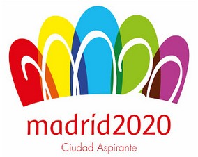
This is their third consecutive attempt to be summer Olympic host. Bright colour petals remind me of a crown. Although it looks beautiful the legibility of “M20” has been mocked on Twitter big time.
Instanbul
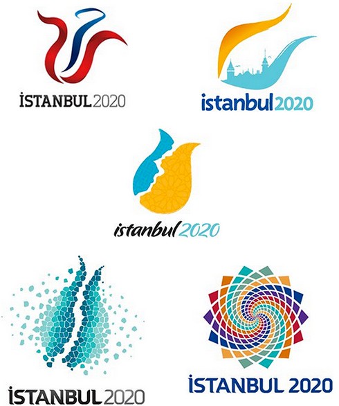
Being their fifth attempt to bring Olympic to Turkey since 2000, Turkish international Olympic Committee asked for public opinion to vote the five Tulip logos
Most voted:
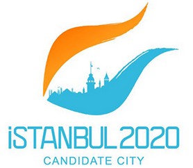
Upper orange part is a symbol of sunset over the city and European side of Istanbul. Lower turquoise part represents Asian side of the city.
Tokyo
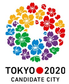
Having hosted one of the greatest game events in 1964, Tokyo easily beat Hiroshima as the candidate city for Japan this time. The cherry blossoms circular wreath that incorporates Olympic colours and purple colour as symbol of Japanese heritage In my opinion this looks spectacular!
What do you think of the logos? Who do you think will be the host? I guess we have to find out when Olympic committee will elect host city in early September 2013.


